
Haartz 2025/ Website Redesign
Haartz Corporation
WEBSITE REDESIGN
In a collaborative effort to modernize The Haartz Corporation's digital presence, I helped contribute core UX design and flow optimization in Figma and Premiere Pro, heavily working alongside my design manager to coordinate with the development partners at Boundary (now almostalways) to ensure a seamless implementation on Sanity and proper company representation.
TOOLS
Figma, Premiere Pro
Sketching, Sanity
PRODUCT
UX/UI Website
PROJECT CONTRIBUTORS
Haartz Team
Almost Always Team
Photographers
TIME
June 2024 - Sept 2025


OVERVIEW
For over 100 years, the Haartz family has led the company with a commitment to sustainability, innovation, and our people. As a leading global manufacturer, we partner with customers to solve their unique challenges through reliable, highly engineered laminates and innovative custom processing solutions. A necessary update needed to occur to showcase the families foundation and companies global efforts.
PROBLEM
The only users on the website were Haartz employees rather than perspective clients or future employees
GOALS
Create a website that showcases Haartz offerings clearly, while showcasing the dedication and family values the company offers.
ACTION
Understand all internal departments and how what attributes they find successful within their own respective departments.
DISCOVER
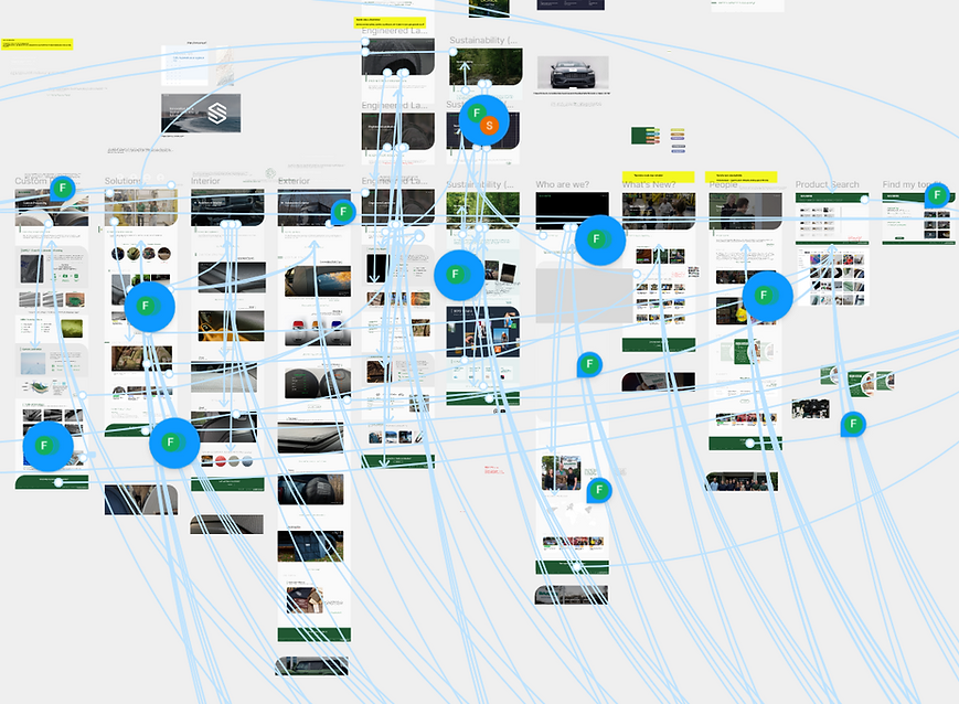
Internal Flowchart
Competitor Benchmarking
The Design team and I referenced many successful websites for certain aspects within the Haartz website to convey the companies personal story telling. Examples of our benchmarking included Amazon, General Motors, etc.


UI Library
Due to Haartz preexisting website, we were able to pull many visual color identities and upgrade to a more modern and legible approach for the next website iteration.
When selecting typography, we needed one that was easily accessible and visually easy to comprehend, and quickly read, making sure we followed accessibility UX/UI concepts.

Internal User Testing
The website went through rigirous internal user testing. Interviewing every single department to see how they interacted with their section, how they sold to our customers, and what was the best way to easily convey information without overwhelming the users and not underselling the company.


